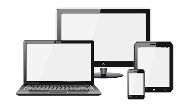
Web browsing on smartphones climbed dramatically after the original iPhone was introduced in 2007. The iPhone was revolutionary because it was the first phone that displayed websites decently. People used finger gestures to zoom in and out to read text on a website. But navigating full websites by zooming in and out became a nuisance. It was only a matter of time before smartphones needed smarter websites. The concept of responsive web design is to create website layouts that accommodate multiple device sizes ranging from desktop computers to smartphones and everything in between. By utilizing a fluid grid system responsive web design positions content based on the available screen space on the device known as the viewport. For example if you have 3 columns of content with the same width there is enough space on a wide screen desktop monitor to see that content in a row horizontally across. On a smartphone the optimal way to view that content is stacking it vertically one below another to fit the viewport. Let’s get started with responsive web design by learning how to use media queries and viewport metadata.
The viewport metadata forces the browser to parse the web page based on the width of the screen. It can also be used to prevent the user from seeing a zoomed out desktop version of the website while on a phone. The viewport metadata essentially declares that the website is responsive:
<meta name="viewport" content="width=device-width, user-scalable=no, initial-scale=1.0, minimum-scale=1.0, maximum-scale=1.0">
The viewport metadata is placed in the head section of your HTML document.
Media queries are versatile and can be used to target different screen devices and even printers. Our focus will be screen devices. Media queries allow you to define specific CSS styles and alternative layouts optimized for each device category. With so many devices already in the market and many more to be released constantly, how can we cover everything? We try to do this by aiming our media queries at the device resolution. Even though there are many different device sizes, they generally fall into a range that defines the device as a smartphone, tablet, or desktop computer. Portrait and landscape orientation also needs to be taken into account for a phone or tablet. The following media queries target many devices using the most common resolution breakpoints:
Smartphones (iPhones and Android phones)
@media only screen
and (min-device-width : 320px)
and (max-device-width : 480px) {
/* CSS styles for smartphones here */
}
Tablets (iPads and Android tablets)
@media only screen
and (min-device-width : 768px)
and (max-device-width : 1024px) {
/* CSS styles for tablets here */
}
Desktop Computers
@media only screen
and (min-device-width : 1200px)  {
/* CSS styles for desktop computers here */
}
The best way to make sure your website is tailored to your audience and their devices is by adding Google Analytics tracking. Google Analytics will give you a percentage breakdown of devices used to view your website over time. This data will save you a lot of time trying to accommodate devices that are never used to browse your website.